The Interior Design Colour Palette Predicted to Trend This Year.
If you’ve ever stood in front of a paint display or scrolled endlessly through interior design pictures, you’re not alone in feeling overwhelmed by colour choices. I hear this often from clients: how do you pick colours that feel right and will still feel good next year? The confusion usually comes from one simple truth — colour trends aren’t about copying what’s on Pinterest or in magazines. Instead, it’s about how the colours make your home feel every day.
People ask me, “Which colours won’t feel outdated soon?” And I always tell them, trends should guide you, but your home’s colour should be a personal, lasting choice. It’s less about chasing what’s popular and more about creating a space where you feel comfortable and calm.
How Colour Trends Actually Evolve
Colour trends don’t just appear out of nowhere or follow fashion whims. They evolve naturally based on how our lifestyles change. Over recent years, as many of us spend more time at home — whether working remotely or simply relaxing — there’s been a growing need for spaces that feel peaceful, warm, and balanced.
This shift is why neutral colours are no longer boring or plain. They’ve become the quiet foundation in homes where people want to unwind. Instead of flashy or bright tones, people are drawn to colours that support everyday living — ones that feel natural and welcoming rather than loud or overwhelming.
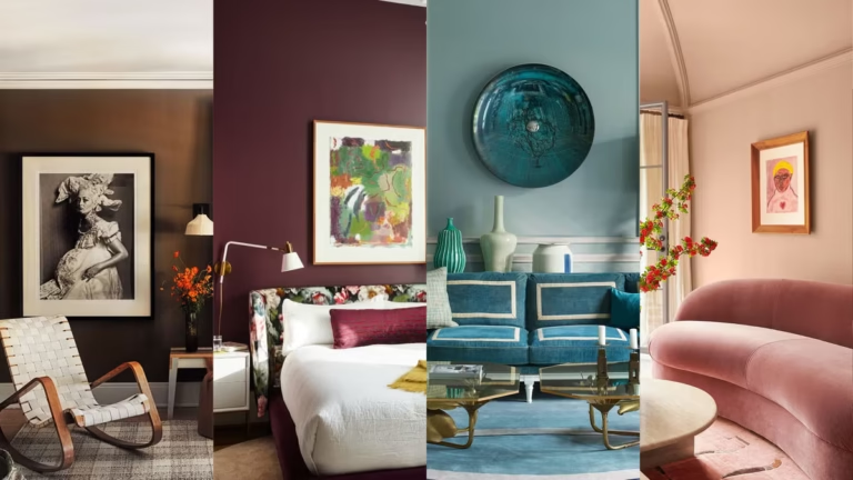
The Colour Palette Predicted to Trend This Year
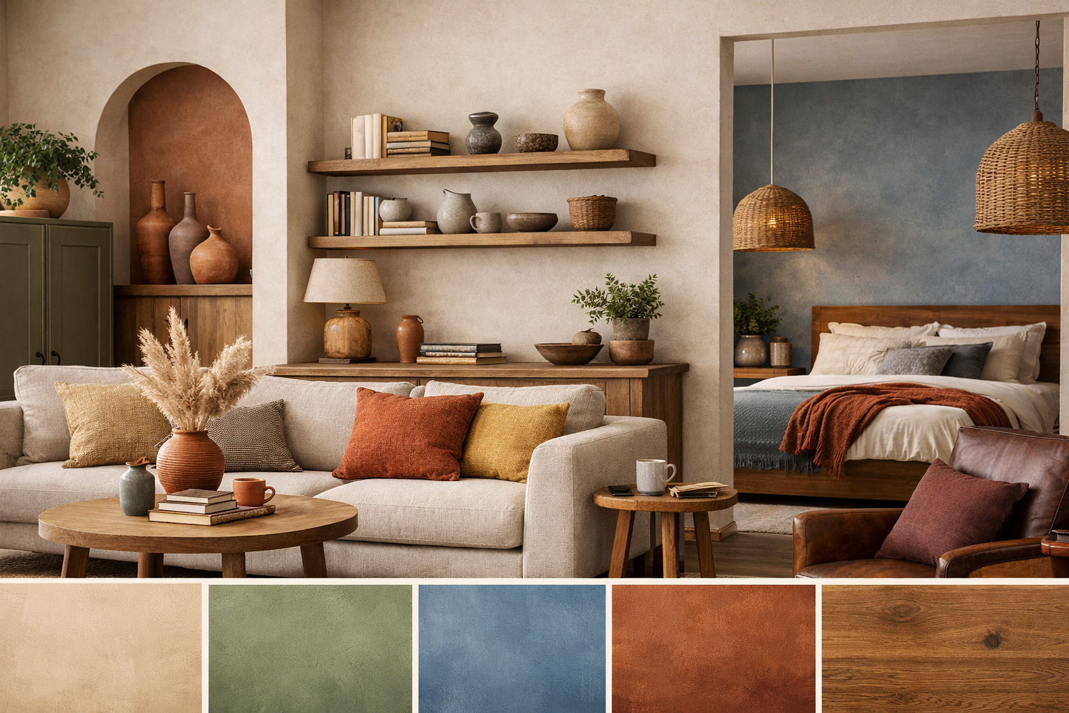
From my work on-site and discussions with clients at Dimensional Architects, this year’s palette feels like a gentle nod to nature and comfort. These colours aren’t about making bold statements but about creating inviting spaces that age gracefully.
Soft Earthy Neutrals
Think warm beige, sand, and clay tones. These colours bring a sense of calm and warmth, making rooms feel cozy without being heavy. They work especially well in living rooms and bedrooms, where comfort is key. A simple tip: apply these neutrals on walls rather than ceilings to keep the space feeling open and grounded.
Muted Greens
Olive, sage, and moss tones bring subtle life indoors. These shades are perfect for kitchens and dining rooms where a touch of nature helps create a relaxed, fresh atmosphere. Muted greens on cabinets or accent walls add character without overwhelming the room. I advise avoiding brighter greens here, as they can feel too intense and less timeless.
Calm Blues
Dusty blue, grey-blue, and soft teal offer a soothing presence. These colours create a sense of space and clarity, ideal for bedrooms and bathrooms where peace and restfulness matter most. Pairing a dusty blue wall with warm wood furniture and off-white textiles can create a balanced, serene space. Just be mindful: in rooms with limited natural light, too much blue can feel chilly.
Warm Accent Colours
Terracotta, rust, muted mustard, and plum add depth and personality without shouting for attention. These warm tones are best used in smaller doses—think cushions, rugs, or a single accent chair—where they bring a welcoming warmth. Terracotta, for example, pairs wonderfully with neutrals and greens and helps anchor a room with its earthy feel.
Natural Wood Tones and Off-Whites
These finishes are timeless. Wood brings texture and softness, making a home feel layered and lived-in. Off-whites are excellent for ceilings, trims, and cabinetry, helping spaces feel airy and open. Natural wood and off-whites blend well with almost all other colours in this palette, so they’re great staples in any home.
How to Use These Colours Without Overdoing It
One of the most common mistakes I see is trying to use too many colours in one home. It can quickly look scattered and lose the calming effect you want. Instead, choose one main colour and support it with two or three complementary shades. This approach creates a harmonious flow throughout your space.
Light plays a huge role in how colours look, so observe how your chosen colours behave in your home’s natural and artificial light at different times of day before finalising. Also, be careful with undertones—a beige with a pink undertone can appear muddy in warm lighting, while a yellowish beige might brighten a space.
If you’re working with smaller rooms, avoid dark shades on large walls. Dark colours tend to make spaces feel smaller and heavier. Instead, use darker tones as accents or in well-lit areas to keep the balance right.
Indian Homes and Real Living
Living in India brings its own unique considerations when choosing colours. The natural light here can be intense, and many homes, especially in cities, are compact apartments. Lighter neutrals and muted colours often work best to keep rooms feeling open and fresh.
Dark colours can highlight dust and require more maintenance, which is an important practical factor to consider. Rather than copying international trends exactly, it’s better to adapt colours to suit our climate and everyday realities.
Colours that have a balance of warmth and coolness tend to age well here. They stay fresh against the bright sunlight and don’t show wear quickly. This is why timelessness is key, especially in Indian homes where practicality meets style.
A Personal Insight from Dimensional Architects
In our experience at Dimensional Architects, we’ve seen that homes with carefully chosen, timeless colour schemes stand the test of time far better than those chasing trends. I recall projects where neutral earthy tones paired with soft accents continue to feel welcoming even years later.
Clients often tell us their colour choices still feel fresh and comforting, not dated or tired. This is the kind of design that truly supports everyday living — colours that serve the people and their lifestyle, not just the trends of the moment.
Conclusion
When it comes to colour, the best advice I can offer is to trust your instincts. Choose shades that feel right for you and your home, not just because they’re trending this year. Colours should make your space feel comfortable and support your daily life.
As a leading interior designer in Mumbai (BKC), we believe colours should serve the people living in the space—not the trend of the year. Thoughtful, lasting choices create homes where memories are made and comfort is always close at hand.