Color Trends in Interior Design This Year
Color Trends in Interior Design This Year
Color plays a critical role in interior design, influencing mood, perception of space, and overall aesthetics. Each year, new color trends emerge based on global design movements, lifestyle changes, technology, and cultural influences. Whether you are designing a home, office, or commercial space, understanding current color trends can help you create modern, visually appealing, and functional interiors.
This blog explores the top color trends in interior design this year and how you can incorporate them effectively into residential and commercial spaces.
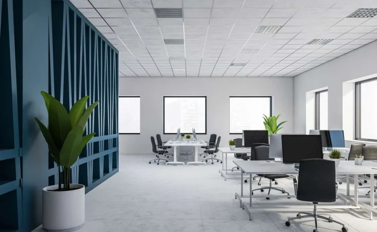
1. Warm Neutrals and Earthy Tones
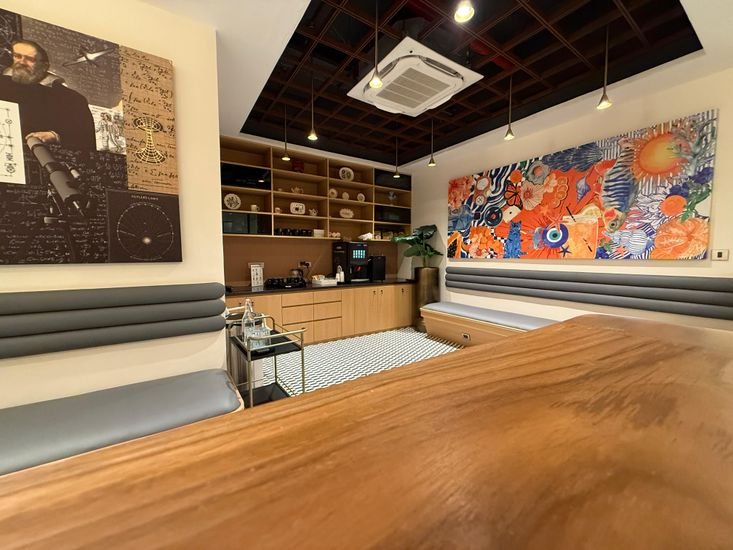
Warm neutrals continue to dominate interior design. Shades such as beige, taupe, sand, clay, and soft browns are replacing cool greys. These colors create a cozy, welcoming environment and work well across various design styles.
Where to use:
Living rooms and bedrooms for a calming effect
Office spaces to create a professional yet comfortable atmosphere
Walls, flooring, and upholstery
Why they are trending:
Growing preference for natural and organic aesthetics
Increased focus on comfort and well-being n—
2. Nature-Inspired Greens
Green is one of the most influential colors this year, inspired by sustainability and biophilic design. From olive and sage to deep forest green, these shades bring a sense of nature indoors.
Where to use:
Feature walls in living rooms and bedrooms
Office breakout areas and coworking spaces
Kitchen cabinets and bathroom tiles
Why they are trending:
Rise in eco-conscious living
Connection with nature and mental wellness n—
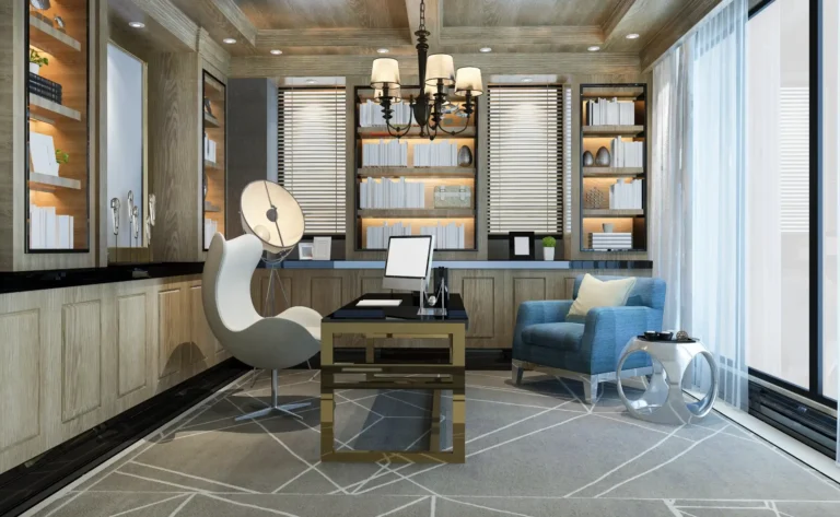
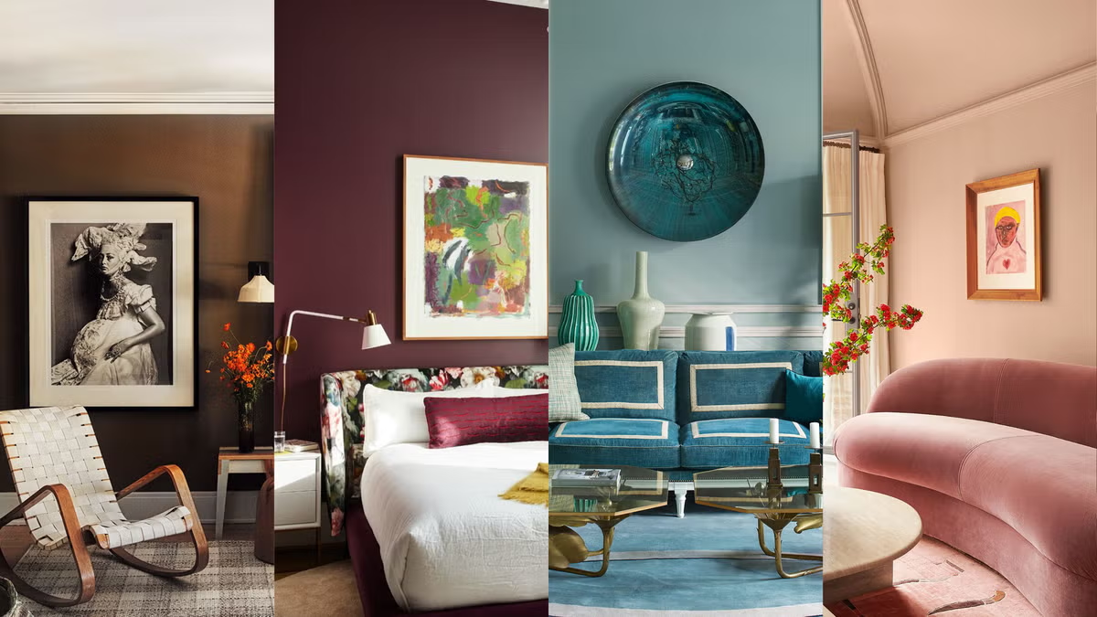
3. Muted Blues and Soft Pastels
Soft blues, dusty pinks, and muted lavender shades are becoming popular, especially in modern and minimal interiors. These pastel tones add subtle elegance without overpowering the space.
Where to use:
Bedrooms and nurseries
Residential and boutique commercial spaces
Accent furniture and décor elements
Why they are trending:
Preference for calm and soothing interiors
Influence of Scandinavian and Japanese design styles n—
4. Bold and Saturated Statement Colors
While neutral palettes dominate, bold colors are being used as accents. Deep teal, navy blue, mustard yellow, and burnt orange are popular for creating focal points.
Where to use:
Accent walls and feature panels
Upholstery, curtains, and cushions
Corporate branding areas in offices
Why they are trending:
Desire for personalization and expressive interiors
Social media-driven design inspiration n—
5. Monochromatic Color Schemes
Monochromatic interiors use variations of a single color to create depth and sophistication. Designers are experimenting with tonal layers using different shades, textures, and finishes.
Where to use:
Modern apartments and luxury homes
Corporate offices and retail spaces
Minimalist design projects
Why they are trending:
Clean and cohesive design aesthetics
Popularity of contemporary and minimal design styles n—
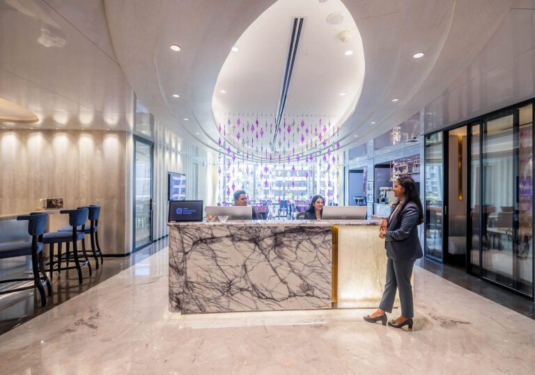
6. Warm Metallic Accents
Metallic tones such as brushed brass, copper, bronze, and gold are trending as accent colors. These add a touch of luxury and sophistication to interiors.
Where to use:
Lighting fixtures and hardware
Furniture legs and decorative accessories
Commercial reception areas and hotels
Why they are trending:
Demand for premium and luxury interior finishes
Combination of modern and classic design elements n—
7. Dark and Moody Interiors
Deep charcoal, black, and dark brown shades are being used in modern interiors to create dramatic and luxurious spaces. When balanced with lighting and textures, dark colors add depth and elegance.
Where to use:
Luxury living rooms and bedrooms
Corporate boardrooms and executive offices
High-end retail and hospitality spaces
Why they are trending:
Shift toward bold, statement-driven design
Increased use of layered lighting techniques n—
8. Sustainable and Organic Color Palettes
Colors inspired by natural materials such as terracotta, stone, wood, and sand are trending due to the sustainability movement. These tones pair well with eco-friendly materials like bamboo, recycled wood, and natural fabrics.
Where to use:
Residential interiors focusing on eco-design
Sustainable office interiors
Hospitality and wellness spaces
Why they are trending:
Growing awareness of environmental responsibility
Demand for sustainable design solutions n—
How to Choose the Right Color Palette
Selecting the right color scheme depends on several factors:
Purpose of the Space: Corporate offices require neutral and professional tones, while homes can experiment with bold colors.
Space Size and Lighting: Light colors make small spaces appear larger, while dark colors create a cozy atmosphere.
Brand Identity: Commercial spaces should align colors with branding.
Personal Style and Functionality: Color psychology plays a role in productivity, relaxation, and mood.
Conclusion
Color trends in interior design this year reflect a balance between comfort, sustainability, and bold expression. Warm neutrals and nature-inspired greens dominate for their calming and organic appeal, while muted pastels and monochromatic schemes offer elegance and minimalism. Bold statement colors and dark moody tones provide opportunities for personalization and luxury, and metallic accents add sophistication. Sustainable and organic palettes highlight the growing emphasis on eco-conscious design.
By understanding these color trends and applying them strategically, homeowners and businesses can create stylish, functional, and future-ready interiors that enhance aesthetics, productivity, and well-being.